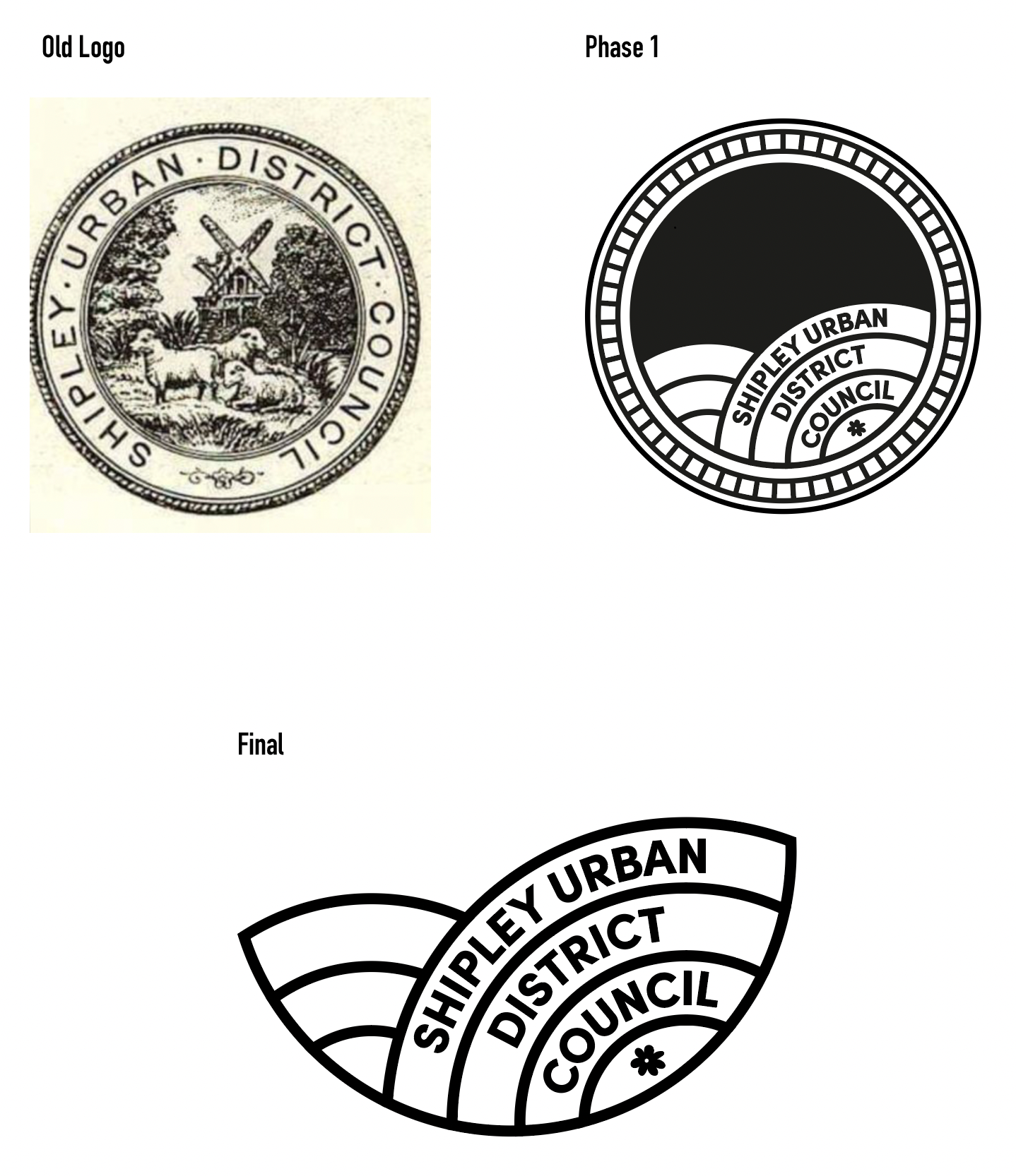
Shipley Council required a redesign and major update on a logo that has served them for many years. After breaking the logo down into the parts that represents the wider Shipley area in the modern day, I was left with a clean, stripped back logo that removed the need for sheep, rope and windmills.
![](https://cdn.myportfolio.com/7fef6cc299f066a8ff7311e28857d69a/6e8d8a1d-97a5-4301-a186-aa64fd263662_rw_1920.png?h=a844faf41c56849c03301c7a662cd4be)
![](https://cdn.myportfolio.com/7fef6cc299f066a8ff7311e28857d69a/0e8ce1b0-0fea-4ac6-82c4-c4a457b2923f_rw_1920.png?h=177c8d8b0dab64e2cd8054d43606f796)
![](https://cdn.myportfolio.com/7fef6cc299f066a8ff7311e28857d69a/cf26d96d-6762-4071-9004-b270eaa50028_rw_1920.png?h=8575ec6b542c13a44a7d561655d96c96)
![](https://cdn.myportfolio.com/7fef6cc299f066a8ff7311e28857d69a/5daccae0-0133-400c-8c68-7f4ab7f50e1e_rw_1920.png?h=e4ce60c70974c110be60eefa455452bb)