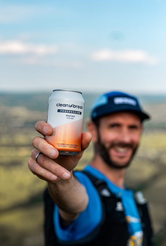
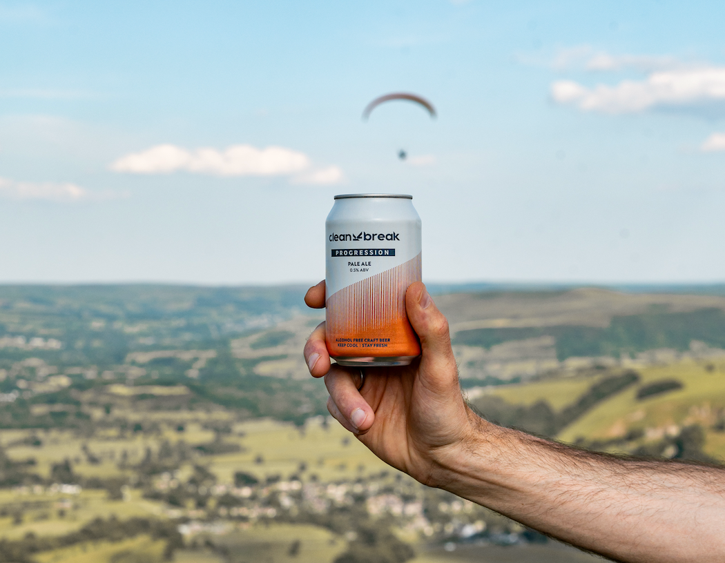
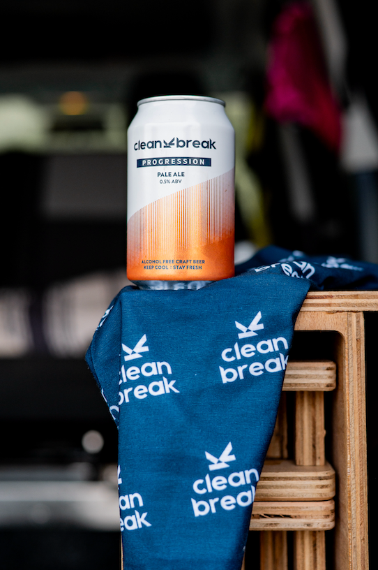
Clean Break is about just that...taking a Clean Break from alcohol be it temporarily or perminantly while seeking adventure and seeking to find your best self.
The logo takes inspiration from the hills and trails where founder Rich enjoys life running ultra marathons and finding new paths to unwind and de-stress.
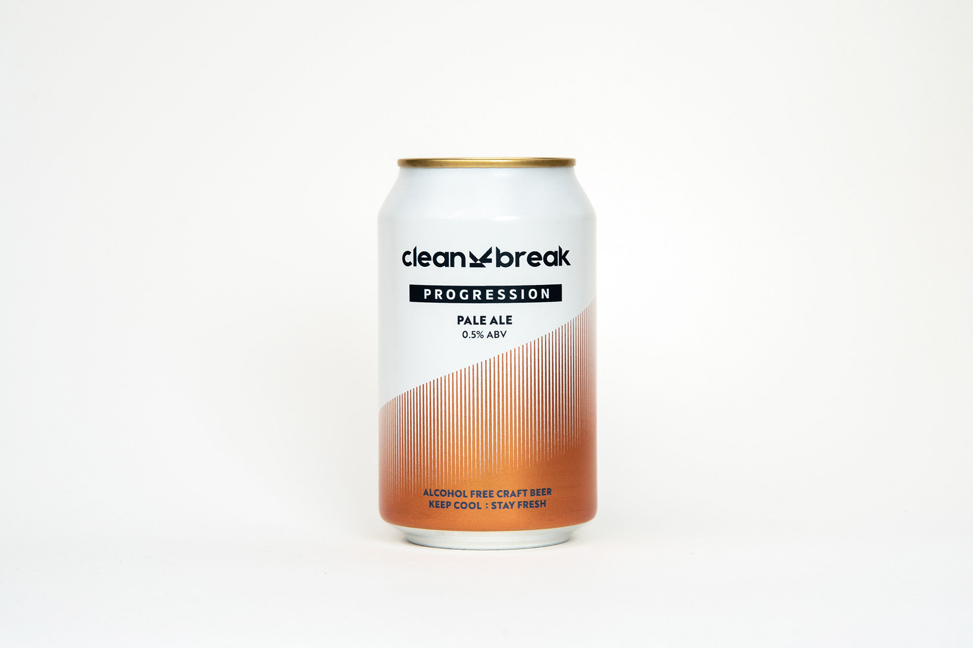
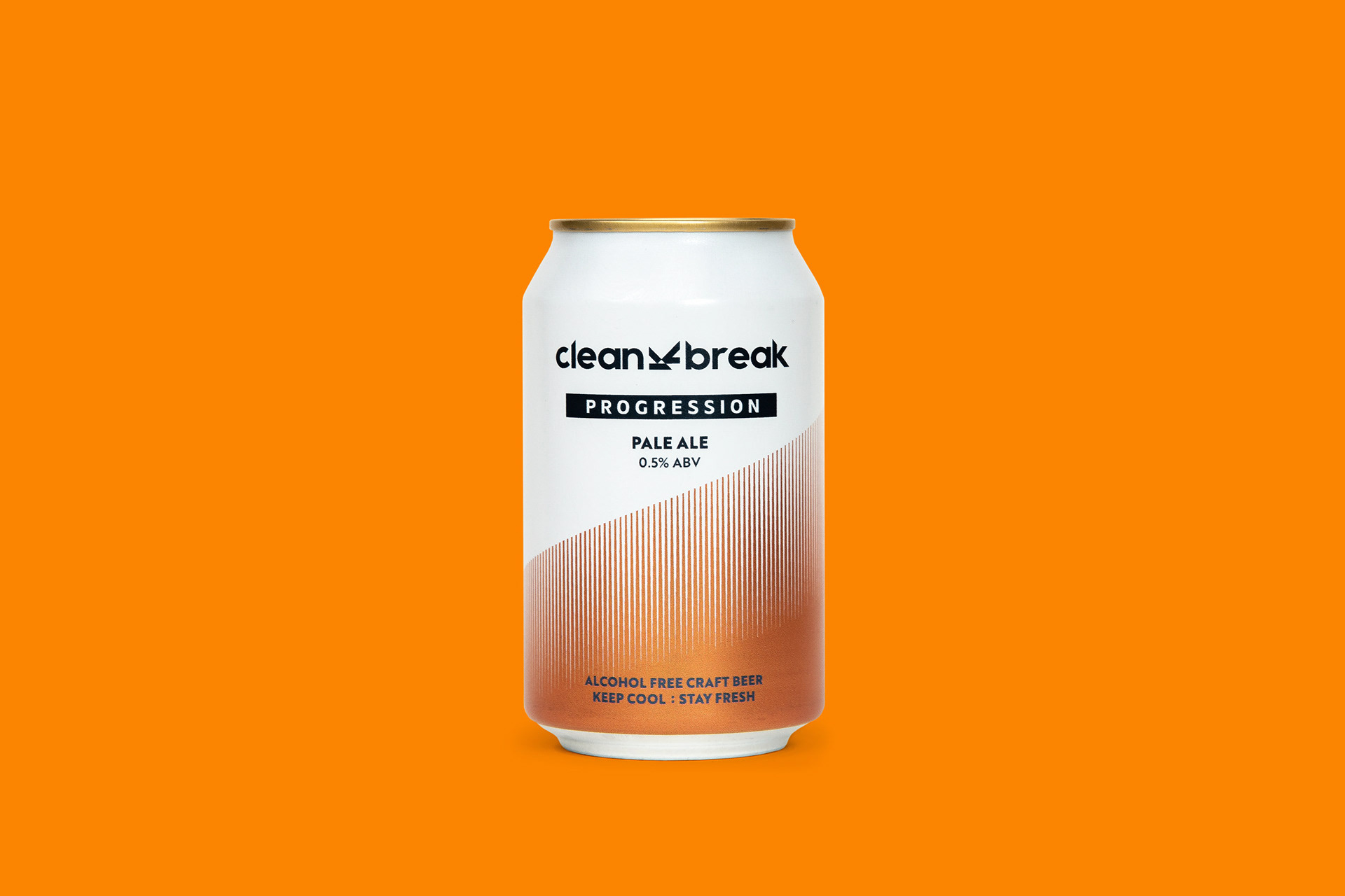
I designed the logo to have clean striking breaks through the typography and an icon which represents the ups and downs of everyones journey. The icon connects the brand with the valleys and mountains that inspired the fresh Pale Ale within the can.
The orange device is a nod to analysing runs and progressing, always looking forward and always upping the tempo.
A "running bib" device was designed on the rear of pack to house all the legal information and barcodes, whilst plenty of negative space allows for a biography and QR code. This enables people to access the brand and community as quickly as possible.